
In this series of articles intended for visual management according to our FLOW Project Management approach, we will see how the use of fever charts can help you detect and implement continuous improvement actions.
If you want to (re) read the previous articles, click the following links ⤵️
- Analytical gain of the Fever Chart: Introduction
- Distribute tasks between resources & projects
- Remake of the project’s history
So how can the fever chart help you identify and take action for continuous improvement?
Let’s take the following 6 Fever Charts and focus on the top 3, and the bottom left one. Do you see something?
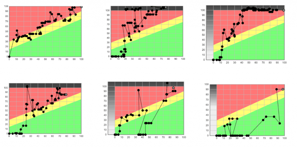
We see that for 3 of the 4 projects, the start-up is relatively fast. But between 15 and 25% of progress, the consumption of the buffer explodes.
So, it might be appropriate to ask what are the events that lead to this overconsumption of the buffer and see what we can correct.
In facts, this is what this company has achieved!
The teams took several actions to prevent this from happening again. It is not about describing these actions here because they are specific.
However, the correct use of the fever chart makes it possible to observe trends and levers for improvement within your projects and within the project portfolio.
In the next and final article in this series, we will see how the fever chart can help you identify the project teams’ behaviors during the project.
In the meantime, if you have any questions or wish to discuss these topics, feel free to contact us!