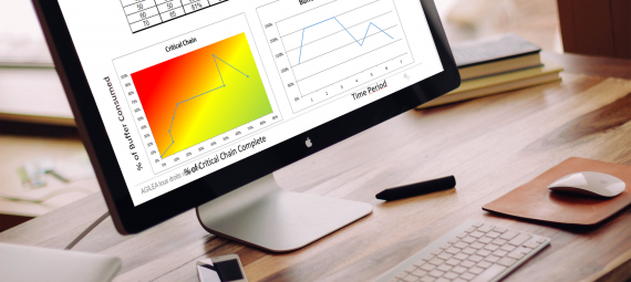
Usually, when we do the FLOW Project Management training, most of the people trained fall under the spell of the performance indicator called the Fever Chart (see the graph below).
Its colorful side greatly helps in decision-making and becomes addictive to know the project’s status and the project’s portfolio.
In a series of 5 articles, we will show you the fever chart ‘s strengths, that go far beyond color coding.
You will have the opportunity to get an article on:
- how easy it can be to make decision with this indicator
- how easy it is to get the project’s history just by reading it
- also, how this tool can help you identify and take actions for continuous improvement
- and how it can help you to improve the project teams’ behavior during the project
Let’s change the market
Therefore, before moving on to the next episode, it’s worth remembering what the Fever Chart is and how it works.
The Fever Chart has two axes:
- The horizontal axis: the time spent
We represent the time spent on the critical chain (remember the network diagram).
The time spent is measured by what remains to be done and not what is done.
- The vertical axis: the consumption of the buffer
We materialize the consumption of the buffer by considering the amount of work that remains to be done.
% Buffer Consumption

Let’s illustrate with a concrete case
With the project’s data below:
- Project of 100 days + 50 days of buffer
- 10 tasks of 10 days each
That means, after the day 10 you completed task 1 and produced 10 days of work.
– Most project managers tend to say progress is 10%.
– In an environment that focuses on flow, we will ask the following resource how much time it needs to complete the task: If they answer us for 15 days, that means there are still 95 working days to be carried out and therefore the progress of the project is 5%
To sum up, after po 10 days you still have 95 working days left, you should finish on the 105th day. You are consuming 5 days of buffer out of the 50 allocated, ie 10% of this buffer.
Let’s change our relationship to colors
When analyzing the fever chart, we often panic when a project is in the red, considering that we are late.
In reality, the situation is different and much better!
- When I am in the red, I am not late because I have not consumed all the buffer. However, I overconsume the protection I set during the buffer. As this overconsumption is based on the rest to be done, I still have the means to return to regular consumption of the buffer.
- When I am in the yellow, I consume the buffer as expected. It’s normal to be in the yellow.
- When I am in the green, I underuse the protection I put on. I’m faster than expected.
% Buffer Consumption

As we will see in the following articles, you will see that the analysis of this indicator is full of improvement opportunities for your projects.

